Science · Code · Curiosity

Solar system evolution
After running my solar system simulation several times I was interested to see how robust the system was. By this I mean that despite the fact that the particles start off randomly distributed, the progress of the simulation is quite similar each time. The details weren't exactly the same each times, but in general, a star formed at the centre of the universe at about the same time and ended up with a few satellites, while several particles were sent flying off into space.
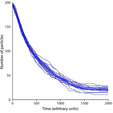
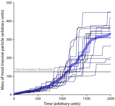
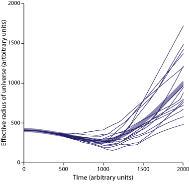
Below are three graphs showing the how the number of particles, the mass of the most massive particle, and the effective radius of the universe change over 2000 units of times. Each graph is based on 16 independent runs of the simulation. Each simulation started with 200 particles with a mass of 1, 2, 3 or 4 units, randomly distributed within a 480 x 360 space. The gravitational constant was 0.08.
This graph shows the number of particles in the universe, which reduces over time as multiple particles coalesce into fewer, larger particles. The line is a classic exponential decay as the probability of a collision (and therefore a reduction in particle number) is dependent on the number of particles (and also the size of the universe, but that changes less rapidly).
This graph shows the mass of the most massive particle in the solar system. In my simulation, when a particle reaches a mass of 125 units, it becomes a star. The graph shows that this event generally occurs just after 1000 units of time. The data is more variable than the number of particles, but in each case a star forms before 2000 time units pass.
This graph shows the effective radius of the universe over time. This value is calculated by taking the distance between the left most particle and the right most particle (the width of the universe) and multiplying this by the distance between the highest and lowest particles (the height of the universe) and taking the square root of the result.
The graph shows how the cloud of particles starts to collapse slowly, but accelerates. Just after 1000 time units (when stars tend to form), the minimum size is reached. At this point smaller particles are flung into space and the size of the universe increases pretty much linearly (and based on a brief look, this appears to be true for at least 5000 time units).
In the future, I would like to see how these patterns change under different the starting parameters (such as the number of particles and the distribution of particle mass).
Comments 4
Leave a comment
Comments are moderated and will appear after approval.
Hello,
I ran a thought experiment last night while trying to fall asleep. My thought experiment led me to look for models of mass condensation in a system over time. To begin with I would like to make a few simplifying assumptions.
1) Homogeniously distributed matter in a fixed volume large enough to ensure that none of the particles in the system can achieve the escape velocity of the system. (If that is possible)
2) All of the matter in the system is composed of the same element at time zero but has the ability to achieve higher values of density as a function of pressure due to gravitational forces. No fusion of elements to higher elements though.
3) Each particle in the system obey's Newton's laws of gravitation.
I don't know how to program a simulation of a system of particles possessing these behaviors. I wish to study a system with trillions of particles but only under an Eulerian perspective. This way the computer doesn't have to track the trajectory of each particle. Where to start?
Hi Ethan,
I've written a tutorial for how to make a simulation like the one I describe here which culminates with:
http://www.petercollingridge.co.uk/tutorials/pygame-physics-simulation/gravitational-attraction/
I've created a 3D version of essentially the same thing here:
https://www.khanacademy.org/computer-programming/challenge-modeling-accretion-disks/1180451277
Both of these obey Newton's laws of gravitation as you mention in point 3.
As for point 1, I'm not sure you can ever avoid particles escaping the system, but I've no proof for that. It could be that if you have enough particles then it would work or at least the proportion that leave would be tiny. Another possibility is to add a rotation to the system, which I tried here with limited success:
https://www.khanacademy.org/cs/accretion-starting-with-a-disk/1208470179
Point 2 is interesting and not something I've tried. I suspect it doesn't make that much difference as it all really means is that the larger particles have a smaller radius than they do in my simulation and so particle are less likely to collide with it.
I'm not sure what you mean by a "Eulerian perspective", but I suspect modelling a system with trillions particles would be very difficult unless you make a lot of simplifications. You might want to look into
Barnes–Hut simulations, which is something I've not tried before.
Greetings Peter,
I am really curious about how you managed to find this awesome information about how the stars are firstly formed as little pieces of atoms and then being pulled together to make a star and etc.
I really want to know how you do all of that amazing stuff! Honestly, I am very interested in how anybody found out about how stars form in the first place! It's fascinating how you do all of this! You might not have time to answer a little 5th grade's comment but, can you at least make a graph about it with a caption or something? Please? I am again really curious and it might take me a moment to process all of this.
Keep it Scientific, Peter! 💗💗 🎆🎇
Hi Julie,
I can't remember exactly where I learnt about the formation of stars. I think I must have picked up from science books and magazines I read as I child. I certainly don't know much about the details of how they form. There is a good video about it here: https://www.khanacademy.org/science/cosmology-and-astronomy/stellar-life-topic/stellar-life-death-tutorial/v/birth-of-stars
I'm a bit biased as the second video in the series is about a simulation I wrote, based on this one, but in 3D.
I also don't really know how we know how they form, but I think asking how we know anything is always an important question. I guess part of the answer will be through creating simulation, similar to this one, only a lot more complex.